
Quick Summary
To mix global art, first choose one unifying element, such as a shared color palette, a repeated motif, or one frame finish. Then balance scale with negative space and plan the gallery wall layout before drilling any holes.
- Use the 60-30-10 ratio: 60% neutral base, 30% secondary tone, 10% accent color.
- Repeat a motif in two or three pieces, not every one, to avoid a set look.
- Choose one frame color and keep frame widths within a similar range.
- Test a gallery wall layout by taping paper templates to the wall for a day first.
- Use warm white light between 2700K and 3000K to bring out earth tones and texture.
Table of Contents
- Why Global Art Styles Clash and How to Prevent It
- Step 1: Pick a Unifying Element Before You Hang Anything
- Step 2: Balance Eclectic Home Decor With Scale and Negative Space
- Step 3: Plan a Gallery Wall Layout Before You Drill
- Step 4: Frame Mixed Media for Visual Harmony on a Budget
- Step 5: Light the Wall So Every Style Reads Clearly
- Placing Your Next Piece: Where a Sri Lankan Original Fits Your Wall
- Frequently Asked Questions
Why Global Art Styles Clash and How to Prevent It
Mixing global art styles at home is easier than most people expect, but it goes wrong when pieces compete instead of connecting, so a thoughtful approach to mix global art pays off. A Sri Lankan painting next to a bold abstract print can look chaotic on its own, yet the same two pieces can feel intentional with the right setup.
Last Updated: November 3, 2026
Clashing rarely comes from the art itself. It comes from the wall: too many strong colors, mismatched frames, uneven spacing, and no clear focal point. Each piece fights for attention, and the eye has nowhere to rest.
- Competing color palettes with no shared tone
- Frames in different finishes and widths
- Uneven gaps between pieces
- No single piece that anchors the group
The good news is that each of these problems has a simple fix. The steps below walk through the process from start to finish.
Step 1: Pick a Unifying Element Before You Hang Anything
Every well-mixed wall has one thread that ties the pieces together. Before you hang a single frame, choose that thread. It might be a color, a shape, a theme, or a frame finish. Without one, even beautiful art can look random.
Start by looking at your existing pieces and noticing what they share. A warm earth tone in a sculpture or a repeated animal figure in two paintings can become your anchor.
Choosing a Color Palette With the 60-30-10 Ratio
The 60-30-10 rule is a classic interior design guide for color balance. About 60% of the room uses a dominant neutral, 30% uses a secondary color, and 10% is an accent. Apply it to your art wall, and the mix of styles feels calmer.
- 60%: A neutral base such as cream, warm gray, or soft white
- 30%: A secondary tone pulled from the largest piece
- 10%: A bold accent, like a red or gold detail, repeated in smaller pieces
For example, if a Sri Lankan painting has deep teal and gold, use teal as your secondary color and add gold accents in frames or small objects nearby.
Using a Motif or Theme to Tie Pieces Together
A motif is a repeated subject, shape, or pattern. Animals, flowers, circles, or geometric lines can all work. When two pieces from different traditions share a motif, the viewer connects them without effort.
Watch out: a motif repeated too often can look like a set. Use it in two or three pieces, not every one.
Step 2: Balance Eclectic Home Decor With Scale and Negative Space
Eclectic rooms work best when no single piece overwhelms the rest. Scale matters as much as color. A massive canvas next to three small prints can look lopsided, while a sculpture placed with breathing room often pulls the whole room together.
Negative space is the empty wall around and between pieces. Give each piece enough room to be seen. Leaving space between frames in a grouping, and more space around a large statement piece, helps each piece be seen.
- Anchor the room with one large piece
- Surround it with medium pieces in related colors
- Place sculptures on surfaces at varied heights
- Leave open wall space so the eye can rest
Step 3: Plan a Gallery Wall Layout Before You Drill
A gallery wall is the most common way to mix styles, and it's also the easiest place to make mistakes. Planning first saves holes in the wall and wasted time.
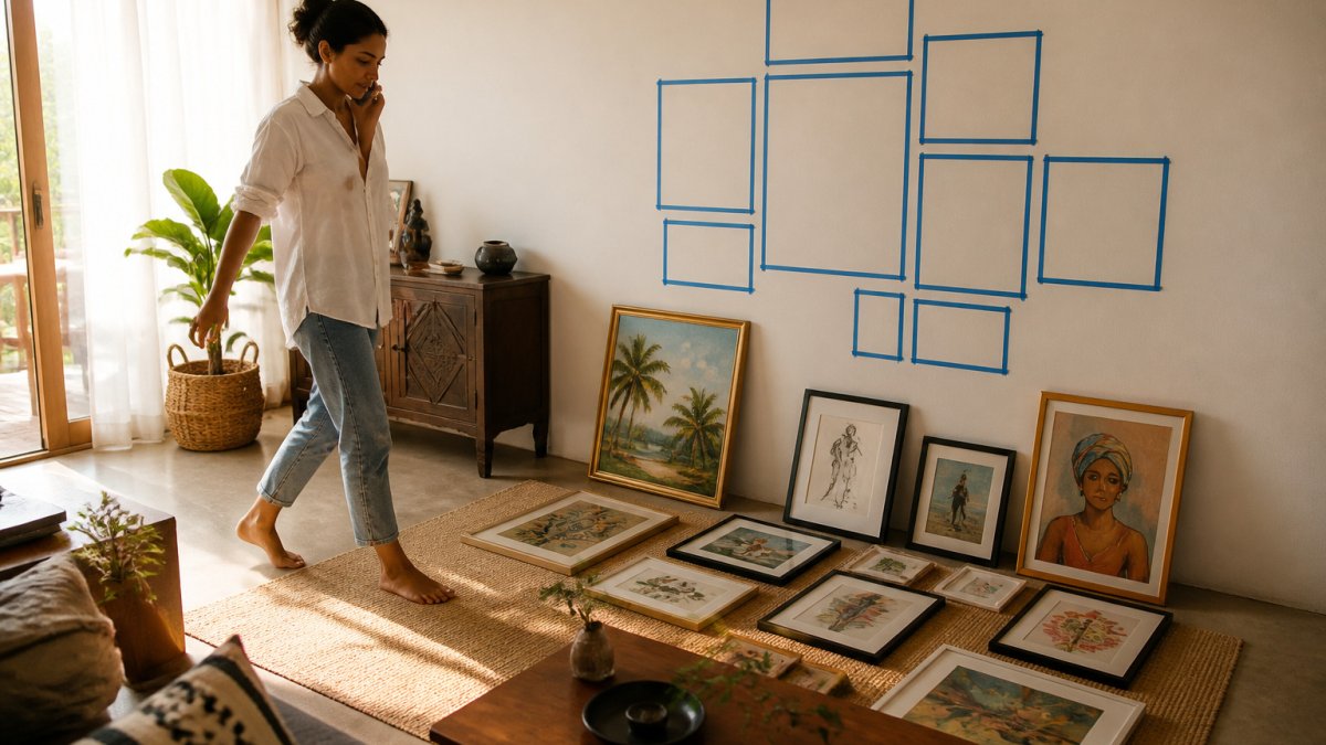
Measure your wall and the pieces you plan to hang. Then decide on a layout shape. The three workhorses are the grid, the salon-style cluster, and the single straight line. Each imposes a different kind of order on mismatched art.
- Grid: Equal spacing and aligned edges. Best when you have several pieces of similar size and want a calm, architectural look. A grid tames wildly different styles because the geometry does the unifying.
- Salon-style cluster: Pieces of varied sizes arranged around a central axis, with consistent gaps. This is the classic approach for mixing global art styles because it lets a large canvas, a small print, and a sculptural object coexist without one dominating.
- Single straight line: All pieces hung on one horizontal centerline. Works well above a sofa or console and is the most forgiving layout for pieces of different heights.
Doing the Spacing Math
The more useful rule is to make the gaps proportional to the pieces. Keep the gap consistent within a single grouping, uneven gaps are the fastest way to make a curated wall look accidental.
Center the whole grouping at a comfortable eye level.
Mapping the Layout on Paper or With Digital Tools
Sketch the wall to scale on paper first.
For a more precise preview, a digital room planner or phone app that overlays a photo of the artwork onto a photo of your wall can help you test a layout before hanging.
Tape the outline of each piece to the floor or wall with painter's tape. Step back, look from the sofa, and adjust until the spacing feels balanced.
Planning for Mixed Media Before You Hang
Canvas, metal prints, and framed paper have different depths and different hanging hardware. A canvas may sit flush against the wall while a framed print projects an inch or more. Plan the layout so pieces of similar depth sit near each other, or accept the variation deliberately, a shallow canvas between two deeper frames can look intentional if the gaps stay even. Check the hanging weight of each piece against the wall type before drilling, and use the correct anchor for drywall, plaster, or brick.
Step 4: Frame Mixed Media for Visual Harmony on a Budget
Framing is one of the easiest ways to unify different styles, and it's also where budgets quietly blow up. You don't need custom frames to get a cohesive look. The goal is consistency in finish and proportion, not uniformity in price.
Choose one frame color, black, natural wood, or white, and use it across the wall. Black reads as a gallery standard and disappears against dark art; natural wood warms up cool palettes; white keeps small spaces feeling open. Pick the one that matches the dominant tone of your largest piece, then repeat it.
Budget-Friendly Framing Hacks for Mismatched Sizes
Art comes in odd sizes, and custom framing for each piece can cost more than the art itself. A few workarounds close that gap:
- Standardize with mats, not frames. Buy off-the-shelf frames in one finish and use custom-cut mats to fit odd-sized art into standard frame openings. A mat in a single color across the wall smooths out size differences and is far cheaper than custom frames.
- Float-mount small pieces. For unframed prints or small works on paper, a float mount inside a larger standard frame gives a consistent outer dimension without custom glass.
- Use frame inserts or spacers. Frame inserts let one frame size hold several art sizes, so a wall of mixed pieces can share the same outer dimensions.
- Skip glass on canvas. Canvas doesn't need glass, and skipping it saves money and avoids glare. For paper and prints, glass or acrylic is worth the cost because it protects against dust and fading.
- Match frame widths within a range. Keep frame widths within a similar range, a thin frame next to a thick one reads as a mistake even when the colors match.
Check the backing and included hardware before buying frames in bulk.
How Framing Interacts With Lighting
Framing choices change how a mixed wall reads under light, and this is where most guides go silent. Glass and acrylic reflect light, while canvas and bare wood absorb it. If your wall mixes glazed prints with canvas, angle picture lights or add a diffused wall light so the glazed pieces aren't catching a direct beam. Warm white light between 2700K and 3000K brings out earth tones and texture in hand-painted pieces; cooler light can flatten them. Avoid direct sunlight on any framed art, since it fades colors over time regardless of glazing.
Step 5: Light the Wall So Every Style Reads Clearly
Lighting can make or break a mixed-style wall. Warm bulbs bring out earth tones and textures in pieces like hand-painted art. Cool bulbs can flatten them.
Place a picture light or a small track light above the largest piece, and let the smaller pieces catch the ambient light from the room.
Watch out: a single overhead ceiling light often casts harsh shadows on framed art. Add a wall-mounted or table light to soften the look.
The article's lighting advice comes down to a few key settings and placements.
| Lighting choice | Recommended setting | Why it matters |
|---|---|---|
| Bulb colour temperature | 2700K to 3000K | Brings out earth tones and texture |
| Placement for largest piece | Picture light or small track light | Highlights the anchor piece |
| Overhead ceiling light | Avoid as sole source | Casts harsh shadows on framed art |
| Direct sunlight | Avoid on paintings | Fades colours over time |
Placing Your Next Piece: Where a Sri Lankan Original Fits Your Wall
A Sri Lankan original can be the piece that ties an eclectic wall together. Its bold colors and cultural detail give other pieces a visual anchor.
For a vibrant statement, the Festival of Color abstract painting works well as a centerpiece. For a culturally rooted option that fits mixed styles, Tribal Splendor pairs its monochrome palette with almost any color scheme, and its intricate detail rewards a closer look.


Fit matters as much as color. Measure the wall before you choose, and use the layout steps above to test the spot first. A piece placed with thought will look like it belongs, even among very different styles.
Frequently Asked Questions
What is the 3-5-7 rule in decorating?
The 3-5-7 rule is a styling guideline that groups decor in odd numbers, usually three, five, or seven items, because odd groupings look more natural to most viewers than even ones. Applied to a gallery wall, you might group three framed works of similar color and five smaller accents in one zone. It works well with mixed global styles because the repeated odd count gives the eye a rhythm even when the individual pieces differ in origin and technique. Use it as a starting point, then adjust by eye.
How do you make different global art styles look cohesive on one wall?
Start with a shared element such as a dominant color, a repeated frame finish, or a common motif. Keep frames consistent in color or material even when the artwork differs, and maintain similar spacing between pieces. Choosing a neutral base for the wall lets the artwork carry the color contrast. Test the arrangement on the floor first so you can judge visual weight before committing. A cohesive wall usually reads as one curated composition rather than a collection of unrelated pieces.
How can I balance traditional and contemporary art in the same room?
Balance comes from visual weight rather than from matching styles. Place a bold, detailed traditional piece opposite a simpler contemporary one so neither dominates the room. Repeat one accent color from each piece in a pillow, rug, or vase to connect them. Give each statement piece enough negative space so the eye can rest. Many homeowners find that a single contemporary frame beside a richly detailed traditional painting feels intentional when the two share a palette.
What are the best framing techniques to unify diverse art styles?
Consistent framing is one of the most effective unifiers. Choose frames in one finish, such as natural wood or black metal, and keep the mat width or border thickness uniform across the wall. Canvas works without frames for contemporary pieces, but floating a canvas in a shadow box can match framed works. Budget-friendly options include buying inexpensive frames in bulk and painting them to a shared color. Consistent framing makes varied artwork read as one display.
